
Friday, 6 November 2009

Thursday, 5 November 2009
A.S - Changes to our Project
Tuesday, 13 October 2009
P.P-C - Group Discussion
A.S - Pitch Evaluation
However, an espect that both us and the teachers are concerned about is that if we do not use a broad range of exciting visual effects, our video could become quite dull and repetitive. Our video idea is based around a narrative, although there will be some performance scenes, involving the singer as a young boy, being neglected by his father, but growing up and forgiving him. To make the video stand to repeated viewings and be an interesting experience, we hope to use lots of transitions from young boy to man, to represent him growing him up, as well as the narrative.
Wednesday, 7 October 2009
P.P-C - Music Video Analysis
http://www.youtube.com/watch?v=7F5hFana8JA
I will be deconstructing ‘Change’ by Daniel Merriweather. Daniel Merriweather is a fairly new artist, he was first noticed after making some successful tracks with Mark Ronson, and he later released his debut album ‘Love and War’ in June 2009. This single was in the top 10 at number 2. Daniel Merriweather’s genre of music is R&B, indie and Acid Jazz.
After watching the video over several times, it was obvious to see that the music video is all performance based. This conforms to the typical music video you would expect to see for this type of artist. Also as he is a recent artist, we want to see more of him (Daniel Merriweather) rather than a story. As the audience we feel as though we can connect a lot more with the artist, if they are singing to us and telling us the story. An example of this is ‘the notion of looking’, which is used through-out the video and makes the audience feel part of the music video (making them feel important) and are therefore more likely to watch the video.

It is important to notice the locations in which the performance takes place, as instead of a narrative being told through the visuals it could be thought that it was being told through the locations we are shown in the background shots of the performance. There is a small link between the visuals and lyrics, for instance the location shows a run-down estate, and in the lyrics he is talking about the two different lifestyles and how it is such a difference and how nothing is going to change for him.

I believe that this music video does not show that much creativity, although is there for one purpose, which is to help promote and sell the track. It is used as a tool, to gain sales and market the track. This is very important for the track and the artist. For instance if a consumer watches the music video and likes the track they are then more likely to purchase and download the song. Due to this track only consisting of performance I therefore do not feel that much experimentation has gone into this video, and could not be called art.
Through-out this video there are many tracking shots used, although in these shots the artist moves with the tracking. This type of camera work may have been used so we can see the artist but at the same time the scenery around the artist, which helps set the scene of the song. I believe that a camera and the artist were placed on a moving object (for example a car) and then started to film. At the very beginning of the music video we are shown a few different location shots, this is for the audience to familiarise themselves with the setting, and for them to recognise certain features in these shots which will help to tell the story, as the artist would want the video to be perceived in the correct way and meaning. Most of the shots in this video are quite long, rather than being fast paced, the shots will be longer for this type of video and genre, due to there being no narrative and mainly showing off the artist. Some types of editing techniques used in this video are the following; Fading into another shot and cuts. The cutting shots are used through the whole of the video; this is quite a simple technique, which goes well with the music video as it is also quite simple. The cutting shots start to become slightly quicker when the speed of the music and beat increases.

Looking at Daniel Merriweather’s clothing it is noticeable no special effort has been made to dress up. This conforms to the genre as most artists in this genre tend to wear very simple, plain, casual clothing, although it is usually darker coloured clothing. As the song and lyrics are talking about different classes and lifestyles, Daniel Merriweather’s clothing connotes to us that he was part of the lower class. We notice in the music video that the weather looks very dull and grey, this also helps to set the scene, it also may connote to the audience from the use of the clouds and the colours that it was difficult growing up around that area and wasn’t a very happy place. All the different elements of mise-en-scene are very important during a music video because they help the audience to understand the message being conveyed. This video is talking about different types of people, classes and cultures, it is trying to tell a message to the audience that if different types of people don’t try and start to get on then nothing is going to change, and there will always be a split between the poor and the rich. This type of video actually relates to the real world and sends a lot of meaning out to the public.
This type of track and video will help to sell his product, as consumers will realise that Daniel Merriweather’s music has a lot of meaning and truth behind it. Rather than the normal, generic things people sing about, this song has a lot of connotation used in it. They also represent the artist in a very relaxed fashion, and manor, which will appeal to a wider range of consumers. In this song Daniel Merriweather addresses different social groups, for example he mentions a guy with a gun and then on the other hand a rich man turning on the garden hose. Two completely opposite types of people, in his music he sings about why the two different social groups cant get on. In this video the ideological discourse is not being challenged the video, is very straight forward, and easy to understand the correct interpretation. Personally I believe that the values and opinions stated through this music video are reinforced by the public, it is the opinion that most people will believe about the different social groups and opinions.
This video will be consumed on lots of different music channels, such as MTV and HITS; it will also be consumed on the internet e.g. YouTube and MySpace. This gives consumers a wide variety in which they can watch the video and listen to the track.
Friday, 2 October 2009
A.S - Music Video Analysis
http://www.youtube.com/watch?v=OikV0hy5mSQ
The single ‘Hometown Glory’ by Adele was originally released in 2007, but in 2008 it was re-released as the fourth single from her album ‘19’. Due to this, there were two music videos produced and released, and I have chosen to analyse the second version. The music video is taken from a live performance by Adele of the song, and was directed by Dugdale. Adele is of a similar genre to James Morrison as both are linked to the term ‘blue eyed soul’ and are both solo artists, although Adele has a much more soulful tone to her voice, and tends to write about heartbreak. This soulful genre is evident through the video, as Adele is on the stage alone, performing to the audience. There are pianists and musicians involved, but they are less visible, and so shows Adele in a spotlight, just simply performing her song, without a high budget music video. This use of a low-fi video shows that Adele is more concerned with putting across her music, so much so that they have used a live performance. The opening shot is a low angled mid-shot of the male piano player playing the introduction, and it then cuts to a long shot of Adele alone on stage with ‘Adele’ written above her in large letters. The video is a performance based video, with no narrative concepts at all. Adele is just singing the song, sometimes directly to the camera. This then leads to the idea that this video has primarily been produced as a means of advertising the artist, as she is the main focus.
At the beginning of the video we see a close up of the sign above Adele stating her name, this has been used as an introduction to the video as it was a live performance. All musicians present, such as the piano player and string players, are wearing black, whereas Adele is wearing a light grey tunic/dress which stands out vastly against the dark settings. This technique has been used so that the audience can familiarise themselves with the artist, as she stands out so much more than other people. Another visual technique used are meat shots of Adele, again so that we can focus on her and become accustomed to her look. The editing pace of this song is reasonably slow, as this is well suited to the song. The song has quite a low tempo, and so a fast paced video would grate against the song and make a confusing and unattractive video. Just before the first chorus is sung, the video is faded out to black, and then a jump cut to a MCU of Adele singing which catches our attention as it is a sudden emergence of colour and visuals. There are also many extreme close ups of Adele whilst she is singing, especially of her mouth. This is evident at 1 minute 38, and has been used as a more visually interesting shot and framing, so that the audience do not get bored of the simple performance video. A large amount of panning and zooms have been used throughout the video, partly so we can see the instruments used and also again as an interesting visual technique to catch our eye.
Throughout the video, Adele is represented as being a strong solo artist. When performing, she is seen to be holding the top of the microphone stand, whilst singing to the side of it. This is representing her as taking control of her career and going what she wants to do, as she is grasping the stand in a possessive way. She is also portrayed as being very earnest with her music, as she often breaks the ‘fourth wall’ by performing directly to the cameras, as if it is a personal performance to ourselves.
This video is aimed at a focused audience, as the song is quite relaxed and it is less likely to catch the eye of the ambient audience. This also applies to the music video, as there it is quite slow paced, with no vivid visuals such as bright lights or fast jump cuts. I don’t believe that this song would be shown frequently on music channels, as it is not mainstream pop, it has a more soulful sound, and therefore it could appeal to an older audience. I also believe that this video has been produced to showcase Adele as an artist and musician, as the emphasis is put on her performance rather than visual effects.
Thursday, 1 October 2009
P.P-C - Example of Shots


 The images show above are shots that our group would like to create in our music video. We think that these type of shots would fit in with the genre of our artist (as the artist in these shots is James Morrison). They will also fit in with the narrative that our group came up with the other day. The use of the sun glare in these shots works really well, and helps to create feelings and emotions.
 Tuesday, 29 September 2009
Group Discussion
N.B - Technical Analysis
Paolo Nutini – Last Request
http://www.youtube.com/watch?v=H4BEwXG4rG4
For my technical analysis, I chose to do a Paolo Nutini song as he is very similar to James Morrison. I originally intended to do ‘New Shoes’ but then found ‘Last Request’. I chose ‘Last Request’ instead because it is a sadder song and is more appropriate to our chosen track. The video is about a robbery in a jewellery shop and Paolo and his girlfriend are caught in the middle of it. The video doesn’t make it directly obvious that the woman is his girlfriend but we get this idea from the way the shots are cut together. The video is a narrative with performance throughout but there is narrative fuzz as the video keeps flashing back to previous events. The majority of the shots are of Paolo Nutini singing whilst laying on the floor. Most of the shots are close-ups or medium shots. I think the shots are mainly these because it helps to show the emotion of the video and also what’s going on at a closer perspective. The video also features a fair amount of panning shots which gives you the idea that you are there and are watching the action going on. Every single shot is cut to the next shot apart from the final shot which fades out. This is due to the action that is taking place in the video. The robbery means fast pace cutting with the action. Also, the shots tend to cut in time with the lyrics and occasionally cut in time with the music. I noticed that in this video there is very little going on with the shots of Paolo and his girlfriend and so it is just these two alone. Throughout the video there is a blue wash on the video which gives it a saddening feel. This is appropriate to the song and also our song and so is helpful for us to look at. There is only 1 location used which is the jewellery shop however there are shots of the outside and the inside of the shop. The shots last for only a few seconds each maximum except for the final shot which lasts for around 7 seconds eventually fading to black to show that the video has ended. The final shot includes no action and I think this is why it lasts longer and fades out to black.
Monday, 28 September 2009
P.P-C - Technical Analysis
http://www.youtube.com/watch?v=AweURFBgHkA
James Morrison was born on the 13th August 1984; he is a singer song writer and guitarist from Rugby. In 2006 the song I have done a technical analysis on ‘You Give Me Something’ became a hit in Europe, Australia and Japan. It was also in the top 5 in the UK and New Zealand. The song ‘You Give Me Something’ was featured on his debut album ‘Undiscovered. The song was also nominated for a Brit Award in the category best British single. There were a few different versions that James Morrison made for this song, may be due to the success of one of his early singles. I decided to analysis this video, as I thought it would be useful to see what type of shots James Morrison used in some of this earlier work, this would help me and my group as we are doing a song by James Morrison. The video is very simple, and is made up of 90% performance. It is clear to understand that as this was one of his earlier videos, he wanted us to see him for his music. He didn’t need to use of lots of graphics and complicated stories. It shows him playing his guitar and singing, letting us come to our own conclusion about his work and music.
Throughout my technical analysis i noticed that the shots which were used the most were; Close ups, Medium close-ups and Medium shots. In these shots we were shown James Morrison singing and playing his guitar. I believe the use of close-ups was to show the emotion and expressions and passion Morrison puts into his work. In the video James Morrison was in most of the shots, this shows the audience that he wanted this video to be purely about him, and maybe allow the audience to come up with there own story to go with the lyrics. There were very few location shots this may be because Morrison wanted us to concentrate on the music, rather than what was happening in the video. The timing of the shots were very quick, none of the shots would be the same for any longer than 3 or 4 seconds, however a lot of the shots that were used had been used more than once, there were a vast amount of shots used in the same location, doing exactly the same as a shot not long before. Through-out this video there was a orange/sepia wash, which made the video feel quite happy and warm. To get this type of wash in some of the shots was due to the sunlight in the background. There are a lot of fast cuts, with the use of fades in some places. It was interesting to watch a James Morrison video and gather some ideas for our own video, which can be incorporated.
A.S & P.P-C - Reccie Evaluation
The aim of the reccie was to remind ourselves of using the camera equipment and to gain experience of completing a reccie in a possible location for our music video. We chose to complete the reccie in a park and also a road, as they are urban and a more relaxed environment, giving us a variation of settings. A shot that we were particularly interested in was the sped up footage of the cars, if a character was included we feel it would really contribute to the feel of our video, as it would be as if the world is just whizzing past our character, as the song is about a boy having a hard life. We also shot footage of Nellie walking forwards, with her back towards the camera and the sun shining down. The video was also really shaky due to no tripod, but we felt this gave a really nice effect to the shot. We edited this shot into black and white and we think this could also be really effective in our music video. Overall, we found this experience really helpful as we refreshed our minds, and we gained some really good shot techniques and ideas for our music video.
Here is the video below:
Saturday, 26 September 2009
N.B - Brighton Reccie Evaluation
We were given a shot list which consisted of:
• 2 exterior locations
• 2 interior locations
• MLS panning establishing shot for narrative/performance
• Use of high/low angle for performance
• Footage for sped up shot of character in crowd
• POV handicam shot
• 360 pan
• Tracking shot with character / performer walking in first person mode of address
• A variety of CUs suitable for instruments
• 2 shots of our own design

I only took 5 pictures as I only had my phone camera but I thought these could be good locations to film at. Picture 1 would make a very nice shot of the character walking towards the camera or they could possibly be leaning against the pillars singing or even leaning against the slanted wall with one leg up. Picture 2 doesn’t have a very attractive backdrop but if you had a close up of the character sitting on the steps or walking down the steps I think the shot could look very good. Picture 3 is of the beach with the pier in the background. I didn’t manage to shoot anything on the pier but I think it could potentially be a good location as I have been on it previously. Picture 4 and 5 are where I filmed the second shot and are where I could possibly film shots of the character leaning over the edge looking into the sea or leaning against the doughnut shaped structure. To make the shot even more interesting I could shoot through the hole in the doughnut with the character placed centrally leaning against the wall.
N.B - Moodboard
 From my moodboard research, I have learnt that all solo male artists appear on their album or single covers. I found that 4 of the covers I found were cartoonised and 3 of those covers still had an image representing the artist. In the case that the artist did not feature, the text was the main part of the cover. In almost all of the covers the artist himself takes up around 50% of the cover with the text taking up around 25% and the other 25% being left for the background. The most common colours used are blues, browns and blacks which connote some of the generic conventions of the calm acoustic sounds that the artists produce. The colours are also very masculine. Also, about half of the artists have covers where they are looking at the audience whereas the other half tend to be looking away whether it is up, down, towards the text or away from the text. Another thing that I have noticed is that on only 1 of the covers the text is directly in the centre of the cover whereas all the other covers tend to place the text on the left corners, although it does depend on what the image is of and how the text fits in. Also, all of the artist appear as themselves and don’t dress up in any extravagant clothing to appeal to a wider audience, they sell themselves as how they want to appear not how the audience wants them to appear.
 N.B - Album Cover Analysis
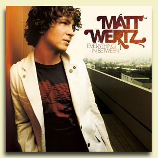 The album cover above is for Matt Wertz’s album ‘Everything In Between’. It was released on the 27th of February 2007 and fits into the genre of indie acoustic singer-songwriter. You get this impression from the cover which is of Matt Wertz himself with simple text stating his name and album title. Also, the cover of the album features plain, neutral colours that are generic conventions in this specific genre. The layout of the cover means that readers will first see the text ‘Matt Wertz’ and by following the typical reading layout, they will then see the text ‘Everything In Between’. These are the two most important things on this cover as it tells the reader who the artist is and what their album is called. Continuing with the reading layout, the reader would then see Matt Wertz himself. He is stood leaning against a wall which appears to be a balcony by what is seen in the background. You only see the top half of his body which takes up about 50% of the entire cover. Another clever technique that is used is that Matt Wertz is actually looking at the text that appears on the cover which draws the eyes of the reader back to the text and emphasises the importance of the text. Something interesting about this cover is that the album is titled ‘Everything In Between’ and Matt Wertz is positioned on a balcony between two walls and so the thing in between the two walls is Matt Wertz himself. This could mean that this album is about everything to do with Matt Wertz. Also, the background is of a city which looks quite urban and so it connotes that Matt Wertz is not something different and out there but he is plain, simple and fun. I think that the only meaning generated from this image is that Matt Wertz is a laidback character because of his slouched posture and smart/casual clothing. There are no references to popular culture in this album cover and so this artist won’t immediately attract people in this sense. Richard Dyer’s star theory explains that an artist is only seen to have a star persona when they are both ordinary and extraordinary and both absent and present. This is apparent in Matt Wertz’s album cover as he appears on the cover (present) but is looking away from the audience (absent). I think that this album would be consumed actively if someone is purposefully searching for it but also passively when people are looking for something else but come across this or quickly glance at it whilst they skim past it. I also think that this album would be consumed by a very large audience from the age of anything between 13 and above because his music appeals to a very wide audience.
 N.B - Advert Analysis
 The advert above is promoting FrYars new single, ‘Olive Eyes’, and debut album, ‘Dark Young Hearts’. FrYars is a solo English singer-songwriter and fits into the indie genre, you can get this impression from the advert alone as it has some typical conventions that other solo English singer-songwriters have. FrYars (Ben Garrett) appears on the advert alone which is a generic convention of solo singer-songwriters however, he is facing away from the audience which is not a generic feature. Also, the text layout, size, font, colour and positioning connotes a solo English singer-songwriter as it is plain and simple. I found this advert in the latest NME magazine at the bottom of a page. The advert is not very large and is dark in colour so doesn’t immediately grab your attention when you first look at the page. However, in terms of the advert, the artists name does grab your attention because it is a large size font. The artists name is in an individual font that the artist probably had created for him whereas the rest of the text in the advert is a very simple font like Arial. This draws more attention to the artist’s name which is what they would want to achieve from the advert as it will only get a seconds glance from the reader, unless the reader is interested in the advert/artist in which case a few more seconds will be taken to read the advert. The advert is split in two with an image on the left and the text on the right. The text is most likely placed on the right as this is where the audience generally looks at first. Also, ‘FrYars’ is the first word that would be read because it appears at the top which is what the artist wants from their advert. Reading down, the text gets smaller and smaller as the information becomes less important, for example, the text that appears in the middle, about his new single and album, is bigger than the text at the bottom about his websites but smaller than the text at the top which states his name. The background of the text is black and the text itself is a creamy yellow colour which stands out from the black. It isn’t a total contrast to the black but is still bright enough to stand out. The image on the left of the advert is of a man facing away from the audience standing in what appears to be an open field. It looks like it is set in autumn as the trees are of an orange colour. The man in the image is wearing a black suit with a white shirt which is very typical of a traditional English gentleman. The man has slick brown hair which is also very typical of a traditional English gentleman. You can only see the top half of his body and you cannot see his face so you don’t get an entire idea of what this artist looks like which means if people are interested they will search for him and discover what he looks like, maybe listening to a preview of his music at the same time. This is exactly what the artist is looking to achieve from an advert. The sky is blue and there is only a single cloud which is positioned above the man’s head. This could signify confusion or a mental block that the artist is currently suffering from. Both the man and the cloud are positioned centrally in relation to the image. This advert is most likely consumed as ambient viewing because obviously it is the text it is and adverts are only ever looked at for extremely brief moments.
 Friday, 25 September 2009
A.S - Technical Analysis of Music Video
http://www.youtube.com/watch?v=wmkcwoomOco
The single ‘The Day I Died’ by Just Jack was released on August 17th, 2009 and its peak position was number 11. The genre of this song is pop/indie, similar to James Morrisson. The music video directors were Ben & Joe Dempsey, and the producers were Jack Allsopp (AKA Just Jack) and Jay Reynolds. The video circulates around a man (James Nesbitt) and his day; however there is a saddening final scene when the man dies. The music video is an illustrative video, as it exactly matches the lyrics in the song. The video illustrates the man life, and a seemingly average but perfect day beginning with his family, going to work, walking home and then being hit by a taxi, however we never actually see him being hit by the taxi, just his realisation that he has. However, throughout the video he is dressed and made up to look as if he has been hit by the taxi already, but he is unaware of this. The general representation of the song seems to be finding out that every day things you take for granted are actually something to be extremely thankful for. The male
 character appears to notice that, as if he knows it is his final day, as he appreciates his family and sees the best side of everything during his day. The thought that the character knows it is his final day is reinforced when there is a close up of the character’s little boy playing with a car and an ambulance during breakfast, as seen to the right.
Throughout my technical analysis I noticed that the majority of shots were medium close ups or medium shots. These shots were used so that the audience can
 see the character and his surroundings, and also a closer look at the character in a particular situation. Close ups were often used at point of happiness or sadness, for example, at 42 seconds we are shown a close up of the character’s face as he hugs his children goodbye, as seen in the shot to the right, and at 3 minute
 s 24 seconds, we are shown a close up of the character’s face as he is dying, as seen in the shot to the left. The only long shots used were when the man was walking to or from work in busy streets, this shows him as being just a normal every day man as he is not particularly noticeable or different from anyone else in the crowd. The video is made to look as realistic as possible, and so pan shots are often used to smoothly move from once scene to another, for example this technique is used at 1 minute 19 when the man is opening a door for a woman, there is then a pan shot to the other door where a man who has just been fired walks out and the next situation begins. High angled shots are mostly used when the character is feeling particularly happy. For example, at 2 minutes 13, the character is seen to be standing above a chalk drawing of a world on a path, a high angled shot has been used here to make it seem as if he is standing on the top of it. This echoes the phrase ‘on top of the world’ conveying great happiness. In reverse to this, a low angled shot was used as the man walked across the road, just before he was hit. The general editing pace of this video is reasonably quick to represent the business of his normal working day, however during the death scenes the editing pace is slowed down as his life is coming to an end and slowing down. The only other editing techniques used are when there are flashbacks of the character’s wife and children, as these clips have been edited to fast jump cuts, with white flashes in between. The scenes where the character is dying have also been edited to a slight slow motion to represent his time is running out and his life is slowing down, before stopping completely. The music track stops a few seconds before the final shot ends, and so we watch in silence as the character’s eye lids are closed by a paramedic. The video then uses a fade out to a black screen to show that his life has ended; black is used for memorial and is often associated with death.
Thursday, 24 September 2009
N.B - Music Video Deconstruction

Visual techniques are used on a number of occasions to add interest and appeal to the video. The entire video is shot from above and rather than the band standing up, they are laying on creepers which are being pushed by men in white suits. They are constantly moving which gives people more to look at and engage in compared to if the band were to just be still and playing instruments. Text graphics are used alongside the singing and are the actual lyrics. They are displayed in a creative way however as they aren’t just in straight lines, some words are placed randomly. Also, the words are in a variety of colours and are displayed as the word is sung. Another really creative technique that they used was to have a title screen saying “Mystery Jets Young Love” which is then swept away by a man in a suit. This tricks the mind and surprises you as you think the words are just graphics that have been added in post-production. There are many references to popular culture in this video as the whole song is about young love and a one night stand from a girl’s perspective and a boy’s perspective. There is also a reference to the messiness of youths as the men in suits are seen to be more adult as they are dressed in plain white cleaning suits and are clearing up after the band. This is backed up by the first and last shot being of a man sweeping the floor.
Colour is used in this video to convey the meaning that youths are fun and make fun out of boring things i.e. the white studio background. Also, the adults are dressed in white suits which separates them from the youths and shows that they aren’t fun. Also, they have the job of cleaning which isn’t fun and is something adults do. Another interesting thing I noticed was that in the very last shot when there is a man sweeping the floor another man walks through what he has swept up and kicks it. This conveys the idea that a bit of fun has worn off on the man and that anyone can have fun. Other shots have elements of messiness in for example there is spilt paint on the shot with Laura Marling in. The shots with Laura Marling are interesting because she is dressed in a white top and black trousers which is quite a contrast to the band members when they are the same age and you would expect them to be represented in the same way. Also, Laura is lying flat on a green rug with a green cushion which is different to how the band is represented. Laura is wearing black and white with colour surrounding her whereas the band members are wearing colour with white surrounding them. This could convey the idea that the band is having fun in a dull world and that Laura is dull with the fun happening around her. Another take on this involves the word “reproduced” on her top. The word “reproduced” could symbolise that she used to be colourful and had fun and that she has been “reproduced” into the “adult” form of being plain and dull, hence the white and black clothes. This also means that rather than Laura just being dull in a fun environment, she has maybe lost the ability to have fun in the environment as she has been “reproduced”. Also, Laura doesn’t move at all, she only moves her lips to sing, whereas the band members are constantly moving throughout the video which further supports the idea that she has lost the ability to have fun. The shots of Laura are motionless and only Blaine appears in the shot, making it very spacious. Also, as the song is about a one night stand from a girl’s and boy’s perspective, and it’s only Laura and Blaine in the shot, the idea that is conveyed is that Laura and Blaine had the one night stand and are singing about it. In addition, Laura and Blaine are in opposite directions i.e. Blaine is facing upside down and Laura is facing the correct way up. This shows a separation between the two, which could represent the idea that they are singing this at separate times.
The general representations in this video are that the band know how to have fun and are exciting in contrast to adults who are represented as dull, boring and controlling over the youths. Youths and adults are the two social groups represented in this video and are highly contrasted throughout. Another view is that the youths are mischievous and the adults are sensible. An example of this is the fact that the band members are constantly moving back and forth which represents fun, being bouncy and jumping around in a childish manor.
This video could be consumed as both communal and solo consumption. I think people would watch it as a group and also as an individual - as a group because there is a lot to discuss and as an individual because there is a lot of inspiration and creativity to be absorbed from the video. That is another reason why I think the video would be consumed as focused viewing rather than ambient viewing as the video has so much going on and is always interesting.
Monday, 21 September 2009
Feedback #1 Deadline 21/9
Keep up the good work.
CF
P.P-C - Advertisement Analysis
In the visual (picture) used in the advertisement, we can see a photo of the artist, looking very calm and peaceful and then we notice that computer graphics have been used on the picture showing white doves, flying towards the artist. Due to the doves facing this direction, we get the sense that Jeremy is the main focus of the picture. The use of the white dove to us symbolises peace, which may then connote his music is about peace and trying to make a difference to what people may think about issues. The colours are very bland, dark and don’t stand out that much. The green colour that is used gives the sense of being very calm. We will also notice that the artist seems to be holding a bird. With the use of green colours, white doves and the fact that the artist is holding a bird all may be elements that connote towards nature and the environment, this all shows meaning through the visuals that are used. The overall appearance of the advertisement is very rough; this may be to show he is a young new artist and finding his style of music.
The Album is called ‘The art of Fiction’; this title is supported through the visuals. It also states it is critically acclaimed; this is used as a marketing technique, and will persuade people to purchase the album. They also emphasis his single ‘Dirty Blue Jeans’, as though it is a must have. We notice that certain information is written in black, to make sure it is recognised as important information and stands out when reading. They have also included Jemery Warmsley’s website and MySpace page on the picture, this acts as another advertisement tool, and sells the artist even further, to find out more.
The artist is represented in a very chilled and refreshing way, with the use of fun fonts, cool colours and not too much going on in the visuals. It is important for the advertisement to reflect the artist, as it gives the consumer a feel for what they might be like. Due to this advertisement being very simple, we don’t actually find out that much about the artist and therefore this makes us want to find out more. This print text is very easy to consume, which means it is more likely for people to read, as it is simple and only includes the vital information.
P.P-C - Mood Board

Sunday, 20 September 2009
N.B - Details of chosen track/artist
It's a shame 'cause he has to go home.
This boy's got to work
Got to sweat just to pay what he gets to get left all alone.
Well let's step outside,
Let's go for a ride,
Just for a while.
No we won't get caught,
Well that's what I thought, until we cry.
Chorus
I'm still here,
But it hasn't been easy,
I'm sure that you had your reasons,
I'm scared for this emotion,
For years I've been holding it down,
For years I've been holding it down.
This girl tries her best every day,
But it's all gone to waste 'cause there's no one around,
This girl she can draw she can paint,
Likes to dance she can skate,
Now she don't make a sound.
We'll play in our park,
'Till it's too dark for us to see
Well we'll make our way home,
With mud on our clothes,
She won't be pleased.
Chorus
I'm still here,
But it hasn't been easy,
I'm sure that you had your reasons,
I'm scared for this emotion,
For years I've been holding it down.
And I,
Love to forgive and forget,
So I,
Try to put all this behind us,
Just,
Know that my arms are wide open,
The older I get, the more that I know.
Well it's time to let this go.
I got to let it go (x4)
Chorus
I'm still here,
But it hasn't been easy,
I'm sure that you had your reasons,
I'm scared for this emotion,
For years I've been holding it down.
And I,
Love to forgive and forget,
So I,
Try to put all this behind us,
Just,
Know that my arms are wide open,
The older I get, the more that I know.
And I,
Love to forgive and forget,
So I,
Try to put all this behind us,
Just,
Know that my arms are wide open,
The older I get, the more that I know.
Well it's time to let it go.
A.S - Analysis of Print Media

The album cover I will be analysing is for the album ‘Sam Sparrow’ release by solo artist Sam Sparro. It was released in the UK one the 28th of April, 2008 and debuted at number five in the charts.The genre of the album is clearly pop, or quirky pop. This is evident through the font used, and the vast amount of colour against a dark background. Pop is often related to bright and glossy colours and modern fashions, all of these conventions are used in the album cover.
There are a variety of visual techniques used, one of which that is particularly noticeable is how the advert captures the audience’s eye with the title at the top centre, with the large image taking most of the space below it. They are both in a central position to the square layout, ensuring that they attract people’s attention. I don’t believe there are meanings generated through this main image and title, as most of the semiotics are present in the finer details such as font, background and image. The only uses of words on the cover are ‘Sam Sparro’ which is used as both the album title and artist. As it uses the linguistic device of alliteration, it creates a catchier title that will perhaps stick easier in people’s minds. References to popular culture include the sunglasses that Sam Sparro is wearing in the image, with the lines going across the lenses. These sunglasses were first brought to attention to the public in Kanye West’s video for ‘Stronger’, and are now a staple item of many people’s wardrobes, but for more a of a humorous than fashion reason. The fact that these are used in the album cover connote that the artist is modern and is a current artist who could appeal to many of today’s younger society.
To begin with, the main image of Sam Sparro represents him as being a popular music artist, as the image is of a photograph of him, made up of glossy bright colours. Much of these colours are seen to be almost dripping off the image, as if to represent Sam Sparro as being indulgent and a luxury, as dripping is reminiscent of these aspects. Around the edges of the image, the colours are blurred in lines, as if it is moving at an incredible speed. This could represent him as hurtling towards stardom, and this is reinforced through the fact that the background is of space with a black background with many stars. This idea of space could also represent Sparro as being something that is out of this world, and perhaps extremely different from anything we have heard before. The actual image of Sam Sparrow is slightly towards the right and from a slight low angle; he is also wearing a slight smile. This smile represents Sam Sparro as being serene, and happy with how his career is going. The fact that it is at a low angle connotes that we should look up to this artist and his talent. It is an almost god-like picture. The font used for the album title and artist is also quite a futuristic style to choose, as it is in a silver metallic colour, with sharp angles. There are also edited indents on some of the letters. This futuristic look could again reinforce that he something different and new. There is also a little sparrow image in the ‘o’ of Sam Sparro, which appears to be his trademark as it is present on the advert as well. Richard Dyer's 'Star' theory says that a person is only seen to have a star persona by being both absent and present and both ordinary and extraordinary. This is portrayed in this album cover, as Sam Sparro is seen as being ordinary through his hat and sunglasses (fashionable items) but also as extraordinary as he is seen to be in the stars.
I believe that this text would be consumed by quite a young audience, perhaps aged 13 – 30 as from the cover it connotes a very modern pop electro sound. I also believe that this album would be consumed by a more curious music audience, perhaps looking for something slightly quirkier from the average pop song, due to its interesting use of visuals on the cover.
Friday, 18 September 2009
P.P-C - Analysing Print Media

The genre of the artist, I believe is put across through the album cover. This is because the album cover is very simple and all about Lemar, this is also what Lemar basis’s his music on (his personal life and occurrences that have happened to him). The album cover has a black and white theme; this may connote how simplistic the artist is. Furthermore these colours may connote different emotions and feelings, for instance white putting across the pure and happy times whereas black for sadness and sorrow. We can also see from the emotion in his eyes that he is a kind person.
The rule of thirds is defiantly used with this album cover, as a consumer our eyes are immediately drawn to Lemar’s eyes, mouth and his name. To us Lemar’s eyes stand out, as though they are putting across what he is trying to say, they are very powerful. This album cover has no need for the use of props as it is strong enough without. The main feature of the album cover is a close-up picture of the artist; this allows us as the audience to feel like they are letting us get to know a bit more about them, letting us in. We also notice Lemar’s eyes are looking up, to us this makes the picture feel quite innocent and a little bit sad, leading us to want to hear what the music is about, therefore this would have been thought through very carefully from a marketing aspect. Moreover the light source in this picture is focus upon the artists face, this giving the artist a glow, making him very innocent and pure.
The writing on the album cover, is very simple also the font used has been used on some of his past albums, this may signify that the artist is still the same but telling a different story, through the songs. The artists name is made quite bold, so that in stores it will catch your eye. However the name of the album ‘The Truth about Love’ is made much more discrete. Although we notice that there is a line underneath the word ‘Love’, to me this connotes and symbolises the fact that love lasts forever, like the line can continue forever. The main iconic sign is the person; we can tell a lot from the artist however in this album cover we don’t get the opportunity to see any type of costume. The background, is a simple block grey colour, this would be used to emphasis the picture and the lighting used on the face. From analysing the album cover I believe that the colour of the font is used to anchor the lighter areas on the face and the eyes.
It is important to notice how the album title and artist’s name differ. The word ‘Lemar’ is written in a very laid back casual way (small lettering), but if we look at the album name, although it is written in a smaller font, the phase ‘The Truth about Love’ is written in capitals, this then makes it feel like he is trying to create a strong message about love.
The artist comes across as very relaxed, chilled and innocent; this is through the representation shown on the album cover. We notice that the design is very simple without the need, for computer graphics, location and writing. We are drawn in by the simple visual and the title of the album ‘The Truth about Love’ this title lets on to the audience, that there is something we don’t know about love. How Lemar is represented, would appeal to a lot of people as, he is sharing something about himself and his experiences with us, to fans this would be a big reason to buy his album. This adds to his meta-narrative as when he first started out winning a programme called ‘Fame Academy’ his first album which released in 2003 called ‘Dedicated’ this to us tells the consumer that he is determined to do well and make something of himself. Later in 2004 his album was called ‘Time to Grow’, to us this could connote, that Lemar is ready to start experimenting with music or the album is telling us his story and what has happened since winning. He then released in 2006 the album I am analysing called ‘The Truth about Love’, from this we now know that he can tell us stories about his life and show another side that maybe he hadn’t let anyone see yet. Through sharing his journey, will help promote each album and sell them to the fans.
This type of print text can be consumed in many different ways, for example; internet (websites), magazines, shops and advertisements. On the internet they can look for the album on Amazon (or other similar websites) and then if they wish purchase the album.
A.S - Advert Analysis

The advert I will be analysing is for the single ‘21st Century Life’ by Sam Sparro, from his album ‘Sam Sparro’. The first thing to notice is that the advert is a relatively small one, found in NME magazine. It is on the right hand side of the page, with central bottom positioning. This is not the most expensive location for an advert, but it must have required a large budget as the right hand page is the one an audience looks at first generally. Sam Sparro belongs to the pop genre, and he uses electro/techno influences throughout his work, and this is evident through the artwork on the advert. A similar piece of artwork is also used on the album, and consists of this image but from a different angle and slightly different editing techniques. Almost half of the advert is taken up of a stylised image of Sam Sparro, made up of block colours such as oranges, greens and purples. These all connote an upbeat pop like sound. The background is a vivid red which also adds to this.
The main visual technique used is the use of the artists name and the artwork. The words ‘Sam Sparro’ are located at the top left of the advert in large cyan letters and in slightly smaller letters below this is the name of the single. Our eye is then drawn to the art image which then connotes the sense of pop-electro music. There is also a little cut out image of a sparrow in the o of ‘sparrow’ which could be perhaps his trademark as it is also present on the album. The use of colour also immediately attracts our attention rather than just not seeing it and turning to the next page. The main meaning generated is again, that this music is more pop orientated, and as it is in a music magazine aimed at young people, that perhaps he is more aimed at this age range of about 16 – 23. In the image art, there are 2 security cameras incorporated into the design, perhaps meaning that he feels as if he is being watched. The information about the actual single is then written in the bottom left corner in white writing, which stands out as it is a contrast to the vivid red. This enables the reader to easily distinguish when they are able to buy or download the single. The name ‘Sam Sparro’ uses alliteration, a common linguistic device that creates a catchy and this helps a reader remember his name. A reference to popular culture are the hat and sunglasses that Sam Sparro is wearing in the image, these are popular accessories worn by young people today, showing he is modern and fashionable.
A significant representation of Sam Sparro is shown through the use of the security cameras. These represent him as being watched as if he has done something wrong, or because he is new he must be watched. It may also represent him as being different and feeling paranoid. This being different is also represented through the choice to use block colours, rather than photographs, as solo artists will often have images of themselves on their adverts or singles/albums.
A.S - Album Cover Moodboard

Tuesday, 15 September 2009
A.S - Music Video Deconstruction
http://www.youtube.com/watch?v=-6Zi4AyzRC4&feature=related

In the opening sequence, Jack is seen to walk into the frame from the left (through a long shot) and pick up a glass orb in the sand. This theme continues throughout the video, with the orb making a few appearances at random points, and Peñate walking about the desert area. One of the opening shots involving the orb is seen to the right.
 s there is no apparently obvious story or meaning to the music video, and he is simply just walking around a beautiful area. Although the beautiful area itself could be considered a form of art. I believe that this video has been constructed for the mere purpose of advertisement and awareness of the artist, and his sense of looking for adventure and freedom.
One of the most obvious visual techniques is the use of a handicam, made even jerkier possibly by post production editing. The camera is also of quite a low quality, giving the video a low fi feel. This fits in incredibly well with the music genre, as Jack Peñate is an indie/pop artist, and a convention of indie videos is to use a low-fi effect in videos to connote that the artist is a credible musician, using normal cameras just like everyone else. This is also reinforced through the opening and ending of the song, as the sound of an old camera shooting is played, again giving a low fi feel to the text. Generally the editing pace is quite slow, leaving the audience to observe the area he is in. However, during drum fills before the chorus and near the end of the song, or when there is a heavy noticeable beat, the shots change to jumpcuts giving a sudden rush to the video. There are also quite a few dissolves used between shots, to create smooth transitions to echo the tranquility found in the desert. The shot sizes vary between long shots, medium shots, and close ups, with the long shots being when Peñate is physically doing something like jumping or climbing rocks, and not singing. This perhaps connotes that when he is just being himself in normal life he feels isolated from everyone else now that he’s lost the person he loves. At about 3 minutes 10, the pace of the song changes and the editing also changes as everything jack does is then re-winded, however this is a brief part of the song, and then returns to normal once the chorus starts. This may perhaps connote that he is feeling lost and confused, and does not know where or which way to go.
 ting to create things and design things in their own way. I think Jack would have had a large say in the video. Also, record companies when creating videos are mainly interested in promoting the artists, so many meat shots are common so the audience grows familiar with the artist’s image, whereas in this video there aren’t many at all.
P.P-C - Deconstructing a Music Video
‘Before the Worst’ by the script is a performance based video. When watching other videos by ‘The Script’ it is clear to understand that there videos are quite simple, although extremely effective. The bands star image is reinforced throughout all there videos including this one. This video is very casual, which in a way makes the band more likeable to the audience, as they don’t need any special effects, its more about their music and the band members, so because of this we as an audience can relate to them much more. The music video has no real relationship to the lyrics. The script focus on showing a performance and the meaning of the lyrics without the need to back them up with visuals. This video may be classed as disjunctive; however it does not involve clips of random scenes that have nothing to do with the music. This music video illustrates the meaning of the lyrics, not through visuals but facial expressions and how the band performs the song, amplifying the meaning.
All music videos can be considered art, although I would still consider this music video art, I would say that it could be argued that it is not. This is because they are not challenging any conventions or showing any challenging new ideas; it is just a performance based video and more about the song. The video is used to advertise the band and show fans a bit more of what they are like as a band. Although there is no relationship between the lyrics and the visuals there is a relationship between the music and the visuals. If we watch the video it is noticeable that when a new instrument comes in or you can hear it a lot more than the other instruments we are shown a visual of that certain instrument, this shows the audience what instruments are used. For example 43 seconds into the video, we are shown a shot of the keyboard panning up to the lead singer, it introduces the instrument and the music that it plays is amplified to show that at that moment that is the focus of the song, the focus is then lead to the lead singer. Through-out the video this seems to be the theme, with a few location shots and shots reminding us that they are just practising. Most of the shots at the beginning of this video are very slow paced, keeping in theme with the music, although when the speed of the music is faster, there are more shots shown and the pace of the editing is increased, this allows the audience to relate the music and visuals together, showing a illustrative view on the music video. Therefore the conventions of the genre and band are reinforced.
This video is very straightforward, although works well for the band and their music. At the very start of the video, before the music has started we are shown a panning shot of the empty seats; this is so the audience understand that the video is showing them in a rehearsal before a concert. The video comes across as a un-rehearsed performance, this allows the audience to relate to the band a lot more, showing the band having fun but taking their music very seriously, this may connote what the band are like, and shows parasocial intimacy. There are lots of location shots, to show they are practising in an empty stadium, these shots are mainly long shots and extreme long shots. They also use a bird’s eye view of the stage to show the band and how busy it is. There are a few high angle shots used, showing the band and the empty stadium, this shot might have been used to show how large the stadium is in comparison to the band, for instance 1.16 into the video we are shown this type of shot. Watching this video I noticed that most of the shots are continuously moving, keeping the audience involved and interested.
There are no special effects used in this video, as it Is very casual and has no need for the use of special effects it also means that this type of video is lo-fi. Most of ‘The Scripts’ music videos are lo-fi, meaning they are acting to the typical conventions of their genre. Due to this video being lo-fi, the different elements of Mise-en-scene are very important. Firstly the lighting used in this video makes the shots stronger and gives the overall video a warm glow. The lights used give the band a warm orangey glow on their faces, this may connote that the band are kind and caring people, therefore warm colours are used, for example at 2.35 a CU shot is used showing the backing singer, in this shot we notice a dark background and then the lights on his face, the lights used here make the shot very bold. The lighting helps to amplify meaning. In the main we are shown shots of the lead singer, this may be due to the record label demands and what they think the audience want to see more of, as Goodwin states. The ‘lights’ connote loneliness, this is emphasised when we are shown the shot of the lead singer walking through the streets, it also gives a feeling of being very dream-like. We are shown, medium shots, close-ups and long shots of just the lead singer on his own, this is so we as an audience become familiar with him as the lead singer and relate to him. The clothes worn by the band are very casual and laid back, the clothing is also very dark, giving the impression that the band are not trying too hard or to dress up. The entire band is wearing the same type of clothing, telling us that they are all as important as each other. Using Dyers critical framework on ‘stars’ it is evident that ‘The Script’ are illustrated as an ordinary group of guys, wearing normal everyday clothing however come across as extra-ordinary in their talent, both with their vocals and ability to play their instruments.
I believe that there is no intertextual reference in this video, due to it being a performance based video, although we might be able to find some hidden meaning, for example, they are singing in an empty stadium, and when the lead singer is walking through the streets and there is no-one there, everyone has gone, gives you as the audience the feeling of being alone.
Considering this video is mainly performance based, it allows us to familiarise ourselves with the band members and what instrument each of them play, by the use of the camera techniques and different mise-en-scene elements. ‘The Script’ allow us to see their ‘before the show’ performance, this being much more of a personal performance, as if the band is letting us see another side of them, which normally we wouldn’t see. Due to this video coming across so casual, it helps to sell the bands product because as the audience we can relate to them much more, as they seem like regular guys. How the band is represented will help to sell more records. When we are shown all of the instruments, and shots of them playing them we can see how talented they are and that they don’t just sing they can do more. There are no ideological discourse issues being challenged or reinforced through-out this video.