Thursday 10 December 2009

A.S - Evaluation: Question 1

In what ways does your media product use, develop or challenge forms and conventions of real media products?
Overall, our media product aims to reinforce and conform to traditional conventions seen with this genre and media products. The genre of James Morrison is acoustic/pop/soul and many conventions of his music videos and other related ones are:
  • CUs and ECUs of the artist
  • Emotive narratives.
  • Shots of the artist singing/playing instrument

    CU of Paulo Nutini for his video 'Last Request'


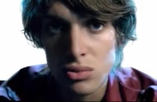
ECU of Adele singing for her video 'Hometown Glory


We noticed that these three aspects appeared in so many of the music videos that we watched for preparation and research, that they were key aspects, and so we tried to include as much of these as possible within our video.

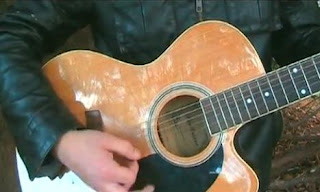
CU of Ben playing guitar


With reference to Goodwin's critical theory framework, we created an illustrative video as the song was written by James Morrison explaining how he had a hard upbringing as a child and felt alone and so we thought this would be the best method to take. To illustrate the song to the audience, our narrative consists of both the older character, Ben, and the younger character, Thomas, in a park with shots of Thomas often being alone in a crowded play area, and Ben sitting in the same places.

Footage of a transition between the two characters sitting in the same place

We amplified the lyrics, mainly through having the artist miming and playing the music, and the guitar also amplifies the sound throughout the video, as the audience will be paying more attention to the music with that footage. There is often a first person mode of address, as Ben is seen to sing the words whilst looking into the camera, as if to tell his story to the audience, this also gives a sense of para-social intimacy.

Footage of Ben singing to the camera - first person mode of address

The main aspect of Goodwin that is frequent is the relationship between visuals and lyrics, as the visual images are directly taken from the song, amplifying it and creating a real narrative for the audience to try and understand, which then makes it stand to repeated viewings.


We decided to shoot all of the footage within the same location, as we thought it was the most suitable location for the music video, but it also kept a sense of recognition and flowing throughout the video, linking the two characters and the narrative together. Although the performance footage is done in a different area of the park, it is still in a peaceful area, creating a relaxing setting and fitting the acoustic feel to the song.


Footage of Ben performing in the park.


Footage of linking the narrative.

There are a variety of signifiers throughout the video, that we tried to incorporate to signify to the audience the meaning of the song, but also to tell them about the artist. As both the digipak and advert designs, and the video are all set in the park location, this immediately signifies a more relaxed sounding music. It is set in an organic location, natural surroundings, with connotes an acoustic sound, which is similar to James Morrison's music.

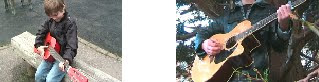
  • Young boy looking to the camera smiling as playing guitar, showed in the shots below - connotes he has found something he enjoys, this follows through as he becomes the musician, music helps him cope.

  • The playground connotes a time of innocence and childhood fun but this is challenged by the narrative having Thomas looking lost and lonely.

  • CU of the young boy looking around - connotes he is looking for someone, as shown in the shots below.

  • The two characters are wearing a similar outfit - connotes they are the same person but at different ages. This is also evident through the footage of them both playing the guitar.

  • Sunny/warm weather when the older character is performing, as shown in the shots below, - connotes that he has moved on and is in a happier time, and forgiven his father.

P.P-C - Evaluation: Question 2


How effective is the combination of your main product and ancillary texts?
It was intentional that we designed our print texts to convey the conventions of the genre and the individual style of our artist. For example in the advert and digipak design we can see that the same font as been used on both to reinforce the brand image of the artist and image we created in the music video. When choosing the font it was important to make sure it conveyed the artist in the correct way. After trying out lots of different fonts, we agreed that the font ‘Dear Joe 5 casual’ was the best. This font looked much more personal and as though it had been hand written, almost as if James Morrison has writen it in an autobiographicial manner.

Picture to show the font and font colour used on the advert and digipak

When deciding what colour font we were going to use, we needed to make sure that it would stand out and that we kept the same font and colour on both the digipak and advert to maintain a brand image. White was chosen as it stood out from the image and connotes purity.

For our image that was used in the advertisement we decided that we would use a shot where the artist is looking away. As this creates and connotes a sense of mystery, as though there is an element of the artist that the audience are yet to find out about.

Picture used in Advertisement.

Our digipak conformed of 4 sides;
- Front
- Back
- Two in the middle.

Through our digipak we wanted to create a warm autumn theme. This was to make sure James Morrison was represented as a down to earth character, as this was the general opinion of James Morrison that we gathered in our first audience research on survey monkey.

The two screen shots below help to show the colour and what type of character our artist is. These pcitures create a visual link which is clear that it is followed through in the music video.


Our digipak conveys James Morrison as a solo artist and through the digipak we learn that he is also an acoustic artist, further helping create a brand image. A visual motif that we have used through-out is the guitar; the consumers can then relate this to the artist and recognise that this is a key feature through-out James Morrison’s music.

The Advertisement
The advertisement was designed to run in The Times and other similar newspapers.As our target audience and demographic (for example age, class and gender) were most likely to see the advertisement here. For instance the age of this demographic would be middle aged both males and females, who would come from a middle class background. This would be more successful broad sheet rather than being diplayed in NME. In the advertisement we decided that certain information displayed should be in different fonts, as we wanted to maintain a visual interest whilst making it easy for people to read.

The orange and yellow circle highlight the two different fonts we used in our advertisement.


Therefore we kept the title ‘James Morrison’ and the title of the album the same as we still wanted to keep the personal feel to the advert. The leading line in the advert is ‘James Morrison’ and then your eye continues to read down the page, this is why the most important information is at the top of the advertisement, such as ‘Out Now’.

Dyer's Critical Framework
By using Dyer’s critical framework on the construct of the star image, it is evident that we have portrayed our artist as having a star persona. Dyer states that an artist must be both ‘Ordinary’ and ‘Extraordinary’ and ‘present’ and ‘absent’. We have shown our artist being ‘ordinary’ and ‘extraordinary’ by showing he is in a park just a normal guy, without the need for materialistic values, however he is ‘extraordinary’ because we can see his musical talent.
We show him being ‘Present’ through shots where he is singing to the audience (first person mode of address). However he is ‘Absent’ as there are also a number of shots where he is looking away.
Furthermore there were a few shots in our video where the artist was singing with a white background behind him, this made this shot look much more dreamy.

N.B - Evalutation: Question 3

What have you learned from your audience feedback?

Carrying out audience research is a vital part of planning and evaluating. Surveys help you question your target audience to find out what they expect from your media text. We carried out a survey to help us decided what our video would be about and to back up our initial ideas. Here is a link to the post:
http://twgsbmedia09a2group8.blogspot.com/2009/11/nb-audience-research-results-and.html
We also carried out some audience research by showing our class our rough cut. Here is a link to the post:
http://twgsbmedia09a2group8.blogspot.com/2009/12/as-write-up-of-class-screening.html

We also carried out a survey to evaluate our video with our target audience and here are the results:

Question 1 - Please could you rate the video.
Thankfully nobody rated our video negatively. We had only 4 people rate it as average. 10 people rated it as good and 3 rated it superb. This is very pleasing for our group as we were anxious as to how people would take it.

Question 2 - What did you think of the video?
The feedback was mostly positive and here are a few of the responses:
- Good considering the budget given.
- I enjoyed it, the way it portrayed the development from boy to man.
- It was good as it told a good story; I also enjoyed some of the cinematic techniques employed
- Looked quite professional.
- Clever, well filmed and made me smile.

Question 3 - What was your favourite part of the video?
From the results it was apparent that there were 3 main parts of our video that people liked:
- Shot of Ben and Thomas sitting together on the wooden springboard
- Shot of Thomas merging into Ben on the roundabout
- Last shot of Ben and Thomas walking together

Here are the clips of the shots:


Question 4 - Please answer the following questions relating to what you did not like.
1. What part of the video did you like the least?
The least favourite part of the video was the shots of Ben with the white background; nearly all of the answers stated this. I think if the background was white or the lighting was better than people may have liked this shot a lot more than they did.
2. Why?
The results showed that people found the shot repetitive, boring, random and distracting from the story. Some people felt that they hadn’t been filmed as professionally as the other shots. This is disappointing for us as we hoped that the shots would enhance the video and focus more on the talent of the musician.
3. What would you change about it?
Most people suggested taking out the shots and adding to the plot instead. Some people suggested that rather than taking out the shots, they could be lit better and could feature more motion to make them more interesting.


Question 5 – What story do you interpret from the video?
The story in our video was about the boy and how he has grown up and changed through his childhood due to different events in his life. A huge 76.5% of people understood this to be the storyline which is really good for us as it shows we made a video that tells the story we wanted.
I thought the following comment was particularly interesting as this could definitely be a reading of the text but would not be a reading of the lyrics.
- Maybe it is not growing up and changing, rather the relationship between brothers, and the similarities that are between them.

Question 6 - Which shots are the most effective and why?
The results for the question were very varied. Here are a few of the comments:
- When the camera is behind the young chap and the sun is reflecting off the lake/pond. This is because of the way in which the light is cutting across the picture.
- The boy changing into the man, it told the story very well.
- The ones taken from lower down, looking up at the boy playing the guitar and the close ups of the little boy.
- The transformations from a young boy to a grown boy and the little boy sitting alone on like the roundabout etc.
- The one with the river it looks really good, also the one when your behind him and with the little boy on the bench.
- The park, with the boy and guy sitting either end of the bench; shows meaning of song.

Question 7 - Would you change the speed of the cutting?
The majority of people said that they wouldn’t change the speed of the cutting which shows that we edited the video together correctly. Reasons for changing the speed of the cutting included:
- Its too jumpy so most emotion is lost.
- I think you cut from one scene to another and back again quite quickly. It might have been better to let the viewer watch a bit more of each scene without cutting away and then back. Viewing images in quick succession gives a bit of a feeling of disorientation.

Question 8 - Would you watch the video again?
Thankfully more people said they would watch it again compared to those who said they would not watch it again which means, in terms of making the music video a success, we have completed our task. It is vital to create a video that people want to watch again otherwise you lose out on a lot of advertising and money. Most people said they would watch it again because:
- It was visually interesting
- They enjoyed watching it
- The storyline was good
- The scenery and locations were appealing
- You always notice more the second time you watch it.

A.S, P.P-C, N.B - Evaluation: Question 4


How did you use media technologies in the construction, research, planning and evaluation stages?

We used media technologies to plan as well as produce our final music video. Nellie and I completed a reccie at a local park, so that we could research what sort of shots we wanted to use. We used the DV camera and a tripod so that we could have both handycam and steadycam shots. The shots that we completed were:

  • Close ups
  • Extreme close ups
  • Mid shots
  • Panning/establishing shots
  • Tracking shots
  • High and low angle shots
  • POV shots

This was a great opportunity to think in more depth about our video, the shots we wanted to use, but also to get familiarise ourselves with the cameras and plan what shots we would like to use.

During the research process of the project, one of the tasks we completed was research into ‘We Media’ and Web 2.0, and how they let the user become more interactive with the Internet and various websites today such as www.facebook.com. Our blog is an example of this, as we used as a collaborative area to discuss ideas and comment on each other’s work throughout the planning and construction.

This is an example of Web 2.0 as it allows our group to interact with each other through the blog. The blog is also another example of Web 2.0 as it allows us to post images and videos up to the blog, from our own sources or from the Internet. We posted images up to the blog, but also video clips for the early stages of research when we were analysing music videos.

We used We Media to upload our preliminary task to http://www.youtube/, a website that allows users from across the world upload videos to share. This let us embed the video onto our blog, but it also allowed other people to look at our idea. Other websites that incorporated We Media are http://www.surveymonkey.com/ and http://www.slideboom.com/ where we uploaded our pitch presentation and also constructed a questionnaire to send out to people via email to gain audience feedback.

Using Adobe Premiere, we constructed an animatic as a group. Firstly we split the track up between the 3 of us and discussed our ideas to ensure that our pictures would look the same and create the right story.

After completing our sections we started to film the images we had drawn.
These were the 3 stages.
-We filmed 3 seconds of each image to make sure we had enough of each shot.
-After this we started to capture the footage we had shot.
-Once this had all been uploaded to Adobe Premiere we needed to edit the images in time with the track, as this would help us plan the final music video much easier and see what type of shots we needed and where.

Here is a short clip of our animatic.


For the animatic we did not use any transitions, just simple cuts as it was only there to show the shots we would use and where. The animatic meant that we could organise ourselves as a group, save a lot of time, it gave us a better indication of how much footage we would need to fill the full 3.30 minutes and finally helped to make a successful video.

When shooting, we used DV cameras.
The challenges we overcame as a group were;
- Making sure that we pressed the button to record rather than stopping the footage being recorded. We found out that when we thought we were recording we had actually been recording the wrong section. When we got back to school and starting capturing on Adobe Premiere we realised what we had done and ensured on our next filming session this would not happen again.
- On our first shoot, we found out that our framing was very poor and needed to be improved. We needed to be more aware, for example think about the rule of thirds and what props were in each shot and if we wanted them there. After this we learnt quickly to be much more aware of our framing and what was in the frame.

Our group had 3 main techniques we needed to consider through-out the editing process, these were;
-Transitions (e.g. dissolves),
- Colour (contrast and brightness)
- Motion

Transitions
Firstly to create more emotion we used lots of different transitions to connote different meanings and feelings. Some of the transitions we used were; cross dissolves, fade in and out and fade to black. The transition used the most was the ‘Cross dissolve’ because as a group we felt that any other dissolves were too harsh for the type of song we were doing whereas this transition was subtle and flowed. The use of the transitions helped convey a message to the audience. The video of the little boy, shows and demonstrates a cross dissolve and how effective it was.


Colour
Was another key aspect of our music video. After designing the advert and digipak it was evident that the colour was a vital part of our theme, therefore we had to make sure that this theme was continued through our music video as well. For example in some shots we would have change the brightness and saturation, to give them a sunny autumn feel. The images shown below shows the colours we were able to include into our music video.


Motion
Finally the last key technique that was important for our group was adding motion, due to some of the shots being too slow and static. For instance when our artist is playing the guitar sitting down we added a pan effect. By doing this do our video it helped our video flow much better, and keep the audience interested. The video below demonstrates one shot which we added movement onto.

Digital Camera
IMAGES TAKEN USING CAMERA
We used a digital camera to take pictures for the digipak and advert. On a few of the shots I took my camera and took pictures for the digipak and advert. Most of the pictures were not used as the lighting was wrong but it helped to give us an idea of what would look good for our digipak and advert. Having a digital camera with us on the shoots was very useful because if we saw a shot that would look good but for some reason couldn’t film it, we could take a picture of it so we could film it at the next shoot. The pictures are of a high quality which is vital for making our digipak and advert look professional.

Adobe Photoshop
SCREENSHOTS OF PHOTOSHOP
I used Adobe Photoshop to design the digipak and advert. For the digipak I used Photoshop to create the leafy effect used on the front cover. I created a few layers with a faded image of some leaves that I took on one of the shoots. I erased some parts so that you can see Ben through the leaves. I adjusted the hue/saturation to give it a warmer, more orange colour which feels more autumnal. For the advert I used the gradient tool to blur the image into the black background. We felt that this was an appealing effect for the advert and draws the reader’s eyes towards the text on the right hand side. For the digipak I feathered a selection and inverted which enabled me to create a black outline to the images which gradually fades in. This makes the images look less ‘stuck on’ and it helps them flow together.

Microsoft Publisher
SCREENSHOTS OF PUBLISHER
We used Microsoft Publisher to put together all the images and text that we edited using Photoshop. It was easier to use Publisher to organise the images rather than Photoshop as you can view cover and inside next to each other. Also, when you print it, the pages are joined together which makes it easier to turn into a digipak.

Survey Monkey
SCREENSHOTS OF SURVEYMONKEY
We used Survey Monkey to create surveys for our initial research and the feedback for our final products. Survey Monkey is a very useful website as it allows you to create the survey, send it out and analyse the results. It can create graphs from your results which are a quick and easy way to explain the results. This was a very useful tool for us to use as it saved us a lot of time.

Brighton Reccie
SCREENSHOTS OF VIDEO
I used a DV camera on a trip to Brighton so that I could record various shots for a practice and also to get some ideas for our actual music video. I captured the following shots:
- MLS panning establishing shot for narrative/performance
- High angle
- Footage for sped up shot of character in crowd
- Performance
- CU for performance
- Low angle performance
- High angle performance
- 360 pan
- Tracking shots of character walking in first person mode of address
- POV handicam shot
- Shot of own design

This practice shoot helped us with our research and planning. We got a better idea of how long it would take to film and how much footage we would actually need to film.

N.B - Digipak and Advert

Tuesday 1 December 2009

A.S - Write Up of Class Screening

Yesterday, Wednesday 1 December, everyone in the class showed their rough cut of their music videos to the rest of the class, as well as our digipak and advert designs. This enabled us to gain feedback from the class but also from both our teachers. It was also really interesting to find out what other groups had produced over the past few weeks. We gained a lot of helpful comments from yesterday's lesson and we will take them into account over the next few days as we continue to edit.

We thought that our advert and digipak was particularly good, mainly due to the photographs that Tally managed to take, they are all taken in a 'warm' light, giving the album a much more rich and warm feeling. We feel that ths echos James Morrison's music as much of it is a relaxed mellow style with mainly acoustic guitars. For the advert, we found a font from www.dafont.com that looks almost like hand writing, which again we felt really suited James Morrison's style as the majority of his songs are from past experiences, so giving a personal feel to the advert reinforces this to the audience.

One of the main aspects that people pointed out from our music video, including the teachers, was that we did not have enough meat shots of Ben, and the ones we did have of him were from the side or at an angle, none were full on. We also agreed with this and have been thinking about it previously, so we are definitely interested in trying to film Ben again, performing the song in CU. We think that if we did that, it would really help our video in terms of conforming to the genre. A few comments also detailed that our music video may not be repeatable as they found it quite predictable and dull. However other people found it stood up to repeated viewing as they wanted to find out the relationship between Ben and Tom. A few editing issues that were pointed out, and that we also noticed, are that in some of the shots the black bars surrounding the image change positions which is really noticeable, so we are going to fix this as soon as possible. Another noticeable point about our video was where we had edited the colours to make them richer, some shots were noticeably different in colour so we need to ensure that it maintains the same colour throughout, so that continuity is present throughout.